
Enhancing your User Interfaces (UIs) with STYLEs and STYLESHEETs
How to create great-looking Input, Edit and Display forms in KBL
This is a topic for Intermediate to Advanced KBL users. Note, for examples of STYLESHEETS in action use the Kwiz (wizard) facility in KSE to locate examples that might be suitable for adapting to your own purposes. Used effectively, the STYLE commands can make a big difference to the overall appearance and effectiveness of your User Interface (UI) forms (e.g. INPUT commands).
Introduction
Without applying any of your own styling, creating User Interface (UI) forms in KBL for displaying, inputting and editing data, parameters, results etc., results in a display of basic default formats (commonly referred to as "vanilla"). The layout will be in a single column, with largely grey colours and standard field behaviours. This may be quite acceptable for one-off and simple utility-style applications but sub-optimal for frequent use by work colleagues or customers. When using the UI command sets (INPUT in KSE), you have the opportunity to bespoke the appearance and behaviours of your forms to provide more attractive and user-friendly applications. One of the great advantages of the STYLESHEET feature is that you can define a 'House-style' for your business or organisation, you only need to create it once and then apply it to all your UI for consistency and uniformity.
Creating KBL stylesheets as in other IT, languages such as CSS, HTML, is not the easiest of topics to understand or learn but once the basics have been grasped, styling will make a big difference to the appearance of your applications. Styling is a big subject and is best learnt through practical use and copying of examples. This article is an introduction and further features, videos and examples will be added over the coming months.
Example
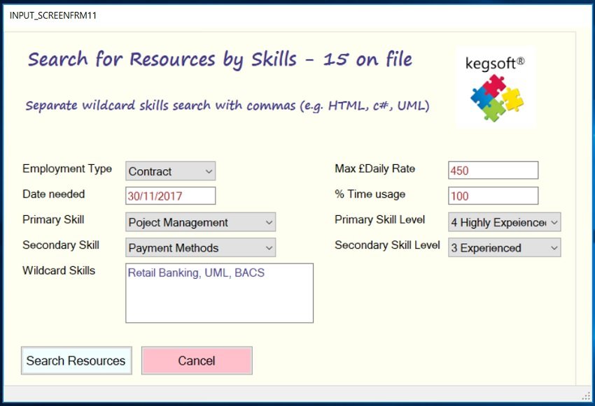
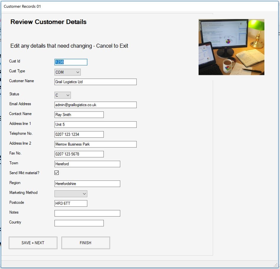
Lets look at an INPUT form implemented in KBL Studio Express with no Styling applied, what you get are the KBL vanilla defaults:
Now, the same form but with a stylesheet applied:
The KBL used to produce the INPUT form is identical in both examples but the difference between the two is dramatic. The styled form above may not be to everyone's taste but it illustrates how the appearance and functionality can be adjusted to suit business requirements. Besides appearance, for example, the Cust Id field at the top is rendered read-only so it cannot be edited and the Notes field at the end has been made multi-line so will retain carriage returns (CRs). There are many properties and attributes that can be amended for layout, data fields and buttons, some are set by Kegsoft but there are many that access the underlying native Microsoft windows platform.
Note that the KBL UI command sets (INPUT in KSE plus BLK in KSP) handle all the logic and "semantics" for your forms, STYLE commands have no logic as they only set the characteristics of the form components when invoked.
STYLE Principles
Levels of Styling
Styling in KBL can be thought of as operating at three (cascading) levels:
Level 1: Where no explicit styles are specified, the KBL defaults will apply (vanilla flavoyr!), which are generally with bland colouring and plain text - suitable for simple form layouts. The first form, illustrated above, is pure level 1, vanilla styling.
Level2: The next level is where the KBL script author / designer provides a STYLESHEET to replace the vanilla styles with "generic" styling formats for specified components in a UI form. If the stylesheet is invoked, all elements of the same component type e.g. TEXTBOXES will appear with this same user-defined generic styling.
Level 3: The third level is where vanilla and / or generic STYLEs are overridden on an individual element basis. For example, a specific TEXTBOX in an INPUT command could be presented in a different colour or be given a specific behaviour. The second illustration above largely uses level 2 generic styling but includes level 3, specific styling for the Cust id and Notes fields as these need to differ slightly in function.
The STYLE command set enables you to override defaults for:
- The basic form outline: Canvas dimensions and background colour
- Field layouts (across or vertical alignment, multiple or single columns)
- Title and Sub-Title font settings
- Field label fonts settings (Font type, size, colour)
- Input/display Field Font settings and behaviours (properties & attributes e.g. read-only, multi-line)
- Control button font and background settings
Because a stylesheet needs to be invoked by UI commands, styling commands are placed ahead of your UI layout sections (e.g. INPUTs) in KBL scripts. Alternatively, styling KBL is put in a separate stylesheet file(s). Apart from tidiness and clarity, the key advantage of creating separate KBL Stylesheet files is that they can be used and referenced by any number of other KBL scripts file to override the default styles. A practical use of this method is for creating a common "house-style" for your business or organisation, the house style stylesheet file(s) can therefore be connected to all KBL files that need them. It is quite possible for one KBL author to create the house-style stylesheet and other authors to use it. For example, you could copy and paste the stylesheet example given here for use with your own INPUT forms.
Logical Layout
The following represents how a stylesheet is laid out. It might consists of just a few lines for a simple generic layout or it could be much larger if the design and various overrides are extensive.
Style.New -- Start of a Stylesheet definition
// First Style Section: specify the generic styling (Level 2) replacing the default style, these styles are invoked implicitly
Style.Box /New -- Generic style collection for a component type (Layout, Canvas, Buttons)
Style.Ctrl /New -- Start the style specifications for a UI element ( e.g a Title)
Style.Def /Prop -- Define a style item 'propert' is a feature common to various element types (e.g. font colour)
Style.Def /Attr -- Define a style item 'attribute' is feature unique to the element type)
Style.Def /Font -- Define Font Type
Style.Def /Margins -- Define margins around the box that contains the element
Style.Ctrl /New -- Start styling another UI element for that component ( e.g a Textbox)
Style.box /End -- End of the Stylebox
Style.Box /New -- Start of another style collection a UI component type
Style.Ctrl /New --
Style.Box /End
// Second Style Section: specify special styles (Level 3) that are invoked by exception by UI commands by referring to the Style.Box name explicitly (a style name command option)
// Specials box 1
Style.Box /New -- Start of collection of styles that are referenced by box name
Style.Ctrl /New -- etc. include one or more element style definitions
Style.Box /End
// Specials box 2
Style.Box /New -- Start of collection of styles that are referenced by box name
Style.Ctrl /New -- etc. include one or more element style definitions
Style.Box /End
Defining your Stylesheet
A Stylesheet is named and can encompasses one or more styled components as detailed above:
STYLE.NEW <name>
E.g.
STYLE.NEW STYLESHEET_1
Within a named Stylesheet are the style components contained in STYLE.BOX compartments. It is through these that you replace the KBL default appearance and behaviour. You may wish to create your own house-style that covers one or more types of component. The key component style boxes for defining your own Level 2 generic defaults are:
- Canvas (CANVAS)- the broad-brush appearance of the form, dimensions, colours
- Field layout (FLDLAYOUT) How the Titles and fields are presented (horizontal or vertical alignment, margins, column and row separations, label and field properties for behaviour, font characteristics, colour etc.)
- Buttons (OK_CANCEL) Background colour, font characteristics of the UI buttons
Examples
STYLE.NEW TYLESHEET_1 // Define a new Stylesheet
// Override default KBL vanilla style implicitly with your own generic styling
STYLE.BOX /NEW M100 FLDLAYOUT // Form layout styles
STYLE.DEF /MARGIN 10 10 10 10 // Margins between outer box and fields
STYLE.DEF /LAYOUT DOWNSEQUENCE_LEFT 10 8 // How we want the fields to be laid out
STYLE.CTRL /NEW CL1 LABEL // Labels: make text green
STYLE.DEF /PROP FORECOLOUR GREEN
STYLE.DEF /FONT Ariel 11 Regular
STYLE.CTRL /NEW CTB1 TEXTBOX // Text boxes: make text red
STYLE.DEF /PROP FORECOLOUR RED
STYLE.DEF /FONT Ariel 11 regular
STYLE.CTRL /NEW CT1 TITLE // Title: big and bold
// STYLE.DEF /PROP FORECOLOUR GREEN
STYLE.DEF /FONT Calibri 14 BOLD
STYLE.BOX /END
STYLE.BOX /NEW MC1 CANVAS // Canvas Style box
STYLE.CTRL /NEW CAN1 CANVAS // Ivory colur background
STYLE.DEF /PROP BACKCOLOUR Ivory
STYLE.BOX /END
STYLE.BOX /NEW M100 OK_CANCEL // Button Styles box
STYLE.CTRL /NEW BUT1 BUT_OK // OK light blue
STYLE.DEF /PROP BACKCOLOUR AZURE
STYLE.CTRL /NEW BUT2 BUT_CANCEL // Cancel pink
STYLE.DEF /PROP BACKCOLOUR PINK
STYLE.BOX /END
To invoke the above style, say in a form created using INPUT commands, the following command INPUT.STYLE statement is required:
INPUT.CLEAR
INPUT.STYLE STYLESHEET_01 // Use styles defined in the STYLEHEET_01
INPUT.DEF /TITLE "Find Customer Details(s)" default 40
INPUT.DEF /SUBTITLE "Filter by Customer name and/or Postcode"
INPUT.DEF /FIELD CUST_NAME TEXTBOX "Leave as All or enter part of Customer Name e.g. Smith " 200 default "All"
INPUT.DEF /FIELD POSTCODE TEXTBOX "Leave as All or enter part / full Post Code e.g. HR6 " 200 default "All"
INPUT.CANVAS /CAPTION_TEXT "Name Search"
INPUT.CANVAS /CANVAS_WIDTH 800
INPUT.CANVAS /CANVAS_HEIGHT 400
INPUT.CANVAS /OK_BUTTON_TEXT "APPLY FILTER"
INPUT.CANVAS /CANCEL_BUTTON_TEXT EXIT
INPUT.SHOW /CLEAR
INPUT.GET /PARS
And the result:
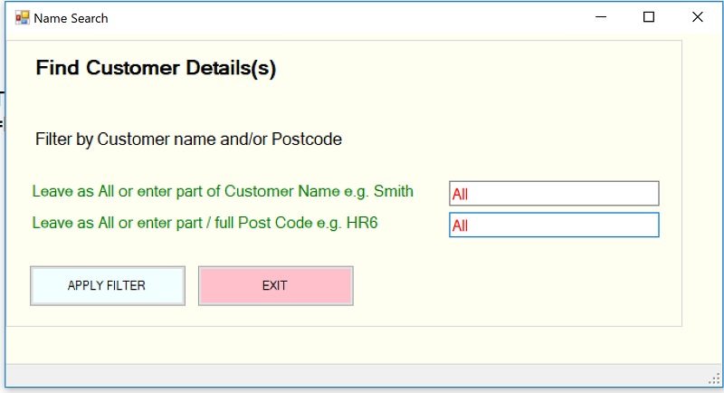
With the INPUT.STYLE command connecting to the defined STYLE, all of the included components and elements specified within it for appearance (and behaviour) will override the defaults.
Note that a UI INPUT sequence can only reference a single STYLESHEET but within a script, different STYLEs can be used for different UI forms.
Overriding a generic format with a specific format
The above STYLESHEET_01 example defines our own generic styling so wherever a command component is used whose type is specified within the stylesheet, it will take the stylesheets's format. However, If in the above form, we had wanted the option to say, by exception to change the colour of the second textbox to blue and bold (to override the generic red colour) we would have to make two changes. Firstly, we would add a specials STYLE.BOX in the Stylesheet.
// Specials Section
STYLE.BOX /NEW TB2 // Define specific styling
STYLE.CTRL /NEW CTB1 TEXTBOX // for a textbox
STYLE.DEF /PROP FORECOLOUR BLUE
STYLE.DEF /FONT Ariel 11 BOLD
STYLE.BOX /END
Secondly, in the UI part of our KBL - INPUT commands for the form above, we would explicitly add the Box name (TB2) to the TEXTBOX INPUT.DEF line that we wanted to modify.
INPUT.DEF /FIELD POSTCODE TEXTBOX "Leave as All or enter part / full Post Code e.g. HR6 " 200 default All TB2
The TB2 box reference would override our generic (level 2) styling.
Note that we could have added other styling elements in the TB2 box (say for the textbox label) and they too would be invoked by the explicit override of the styling reference TB2
More about the elements and controls that define a style
Give each STYLE.BOX's own name (that's unique within a stylesheet), this name is of no importance for defining the generic styles but, as shown above, the name is significant for applying different styles to specific fields.
Within a STYLE.BOX, styling for UI elements are determined by style controls e.g.
STYLE.CTRL /NEW T1 TITLE
This instructs the KBL Processor to look out for control items that relate to styling for a TITLE. Any items that follow the the STYLE.CTRL relate specifically to that UI element up until another control command or a STYLE.BOX /END.
Taking a snippet of the above example that relate to field labels
STYLE.CTRL /NEW CL1 LABEL // Labels
STYLE.DEF /PROP FORECOLOUR GREEN
STYLE.DEF /FONT Ariel 11 Regular
This instructs the KBL processor to render field labels in regular Ariel font, size 11. It is also to appear in green. If we wanted a larger, bolder font in red for field labels, we could have specified:
STYLE.CTRL /NEW CL1 LABEL // Labels
STYLE.DEF /PROP FORECOLOUR RED
STYLE.DEF /FONT Ariel 12 Bold
There is no limit to the specifications for a UI element so we can be very prescriptive about how, say a TEXTBOX field should appear and behave:
STYLE.CTRL /NEW C2 TEXTBOX // define style for a textbox
STYLE.DEF /PROP FORECOLOUR DarkSlateBlue // text in dark blue
STYLE.DEF /PROP BACKCOLOUR White // White behind the text
STYLE.DEF /PROP WIDTH 200 // box 200 x 60 px
STYLE.DEF /PROP HEIGHT 60
STYLE.DEF /FONT Ariel 11 Regular // regular Ariel font, size 11
STYLE.DEF /ATT MULTILINE TRUE // Allow multiple lines of free text
STYLE.DEF /ATT READONLY FALSE // Can read or write
The possibilities for style controls are very extensive (and will be further documented) but note that most of the key STYLE command set formatting and controls are included in the Intellisense system just as any other commands.
Control items and options
The STYLE.CTRL command identifies the UI element type to be styled specifically for the STYLE.BOX in which it resides. So inform the KBL processor we want to set the style, say for a textbox we use
STYLE.CTRL /NEW C2 TEXTBOX
Under this CTRL (control) we add the styling items we want to amend. These items are the individual parts of styling and comprise the following types:
STYLE.DEF /PROP which are properties that are generally common across a number of UI items such FORECOLOUR, BACKCOLOUR used by labels, titles, textboxes
STYLE.DEF /ATT which are attributes of the item that are generally unique to the item e.g. MULTILINE in a textbox
STYLE.DEF /FONT which is used to define the font name, size and style (Bold, regular, italic)
STYLE.DEF /LAYOUT used to specify how the fields and labels on a form are presented e.g. number of columns, position of labels
STYLE.DEF /MARGIN defines the top, bottom, left and right margins with the form box
Note that it is /PROP and /ATT items that correspond to the Microsoft windows properties and attributes so, for something very specific you may find an MS attribute or property that can utilised in a KBL UI form.
Using STYLESHEET KBL Files
The Style defined as STYLESHEET_01 could have been put in a separate KBL file rather than incorporated within the normal function KBL script e.g. in a normal KBL file called XY_STYLESHEET. Note that more than one Stylesheet definition could be placed in the same file (e.g. STYLESHEET_02).
A KBL script that uses a separate stylesheet file needs to connect with both its filename as well as name of the Stylesheet(s) to be used.
The stylesheet file used is connected, usually near the beginning of a script with other general definitions and parameter settings) E.g.
USE X1 /STYLE STYLESHEET_01 // Associate the stylesheet file with a reference name, e.g. X1
Then, when the style needs to be used, say in an INPUT definition:
INPUT.CLEAR
INPUT.STYLE X1.STYLESHEET_01 // reference STYLESHEET_01 in the X1 file association
INPUT.DEF /TITLE "Find Customer Details(s)" default 40
INPUT.DEF /SUBTITLE "Filter by Customer name and/or Postcode"
Etc.
The X1. prefix tells the KBL processor to use the style definition in the USE file defined by X1. If required, multiple file associations (X1, X2, RFEF, etc). can be used in a script.
Sharing Stylesheets
It is quite possible for one KBL author, with perhaps more styling experience, to create the house-style stylesheet and other authors to use it. For example, you could copy and paste the stylesheet example given here for use with your own INPUT forms.